 |
| From the living area looking back towards the sleep zone. |
 |
| This is what is used to look like when you walked in the front door |
 |
| Looking back at the front door. Are there windows under all that lace? |
 |
| The old light fittings and you can also see the old (gross) cornice. |
 |
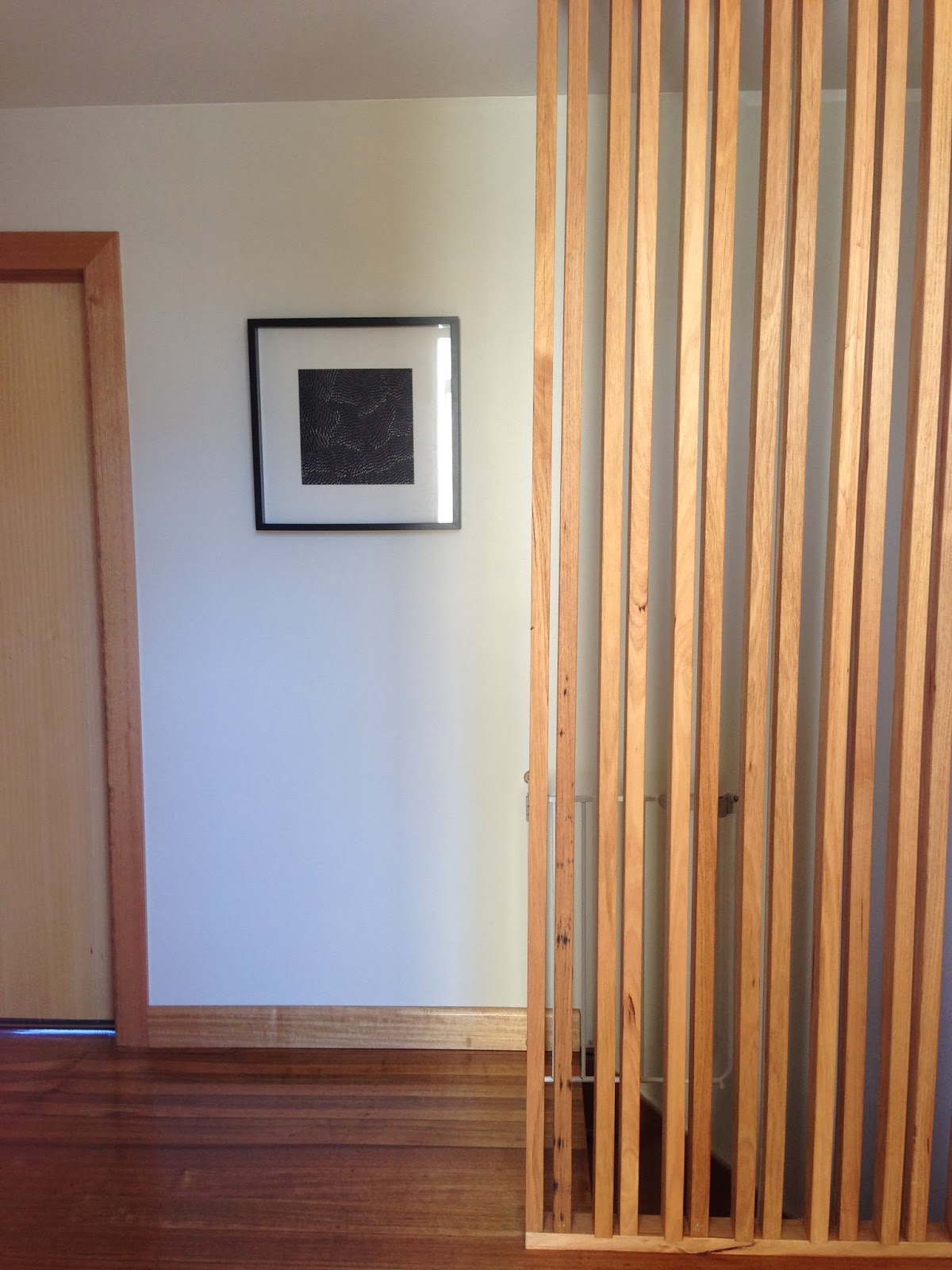
| Ignoring the baby gate and the bottom of the stairs (which is clearly not yet renovated), the hallway is so simple but makes for a gorgeous entrance to our house. |
 |
| It's certainly a darn sight better than it was!! |
So there's a look at the entrance hallway to the new retro house. Maybe more modern than retro but I think the pendant and the large knobs on the linen cupboard are a nod to the retro beginnings of the house. That's all I really want to do in a way, create a modern house that has a few retro touches. Let's face it, if I wanted a retro house, I wouldn't have renovated it in the first place!
Cost:
Linen Cupboard $1342.12
Spray finish $917
Instal labour $630
Fancy Wardrobe Knobs $120
Floors $800
Screen Timber $400
Lighting/sparky $500
Plaster/paint etc $300
Total $5000


Looks fantastic Alex! I'm not sure why you got rid of that beautiful purple colour though! Eek! Also we have a glass front door at the moment and I hate it, there is no running from the pesky door knockers or that Aunty I didn't know was visiting when my house is disgusting. I know yours isn't glass but all that glass next to it? I love love love that copper light! xx
ReplyDeleteHi Holli,
DeleteYou know, the glass isn't nearly as bad as you would think (for privacy). It's tinted grey for a bit extra privacy, it can't be seen from the road and when you get to the door you can only see a view straight forward (and that is the screen). The bedrooms and bathroom is down the other end and not visible. The lounge/kitchen is all hidden too. AND lets face it, if anyone came along that I wanted to hide from, curtains or not, my children would spoil any attempt to seem like we're not home!
We used to have a glass door at the old house and that was far worse, anyone on the street could see right into the house. My mum caught Roge doing a nudie dash from the bathroom to the bedroom on many occasions!!!
I hope all is well, I'm loving your blog. You really are a super mum.
X
I agree. Those windows beside your front door really look gorgeous without curtains on it. And in my opinion, it adds a welcoming mood of the surrounding environment. Sweet! With this done, do you have other plans for renovation?
ReplyDeleteLynne